Concept Project
Role: UX/UI Designer & Researcher
Timeframe: 4 weeks
Redesigning the website of an iconic local record store
The challenge
Waterloo Records is an independent music and video store in the heart of Austin, TX.
With almost 40 years in business, this store has played an important role in the music scene that the city is famous for, and it is often listed as one of the best of its kind in the US.
In order to boost online sales, Waterloo's website needs to be just like the physical store: the go-to place for customers looking to buy good music.
Note: This concept project was an educational exercise to practice UX skills and it is not affiliated to Waterloo Records.
The Process
-
User Interviews
Affinity Mapping
Usability Test
Plus/Delta Analysis
Competitive Analysis
User Persona
User Journey
Problem Statement
HMW Questions
-
Information Architecture
Card Sorting
Sketches
Wireframes
Task Flows
Mid-fidelity Prototype
Visual Style Guide
UI Components
-
Usability Test
Design Iteration
High-fidelity Prototype
The outcome
With a more intuitive navigation and a clean layout, the redesigned e-commerce experience allows customers to easily discover and find the records they want to buy.
Research & Synthesize
User research
How and why are people buying records nowadays?
I started off this project conducting 5 interviews, to understand the the users' motivations and challenges, and the difference in their experience when buying records off vs. online.
In a world where most people get their music from streaming services, what drives people to buy records?
Key Insights
Understanding the user's perspective
To me, records are nice collection items and I enjoy the ritual of playing albums.
I like to spend time reading about the music, the artist and how the album was made.
At a record store, I like to flip through every album, hear the staff recommendations and discover new music.
Online, I tend to buy in marketplaces (i.e. Discogs, Amazon) when I'm looking for something specific. There’s nothing really special about that experience.
Plus/Delta Analysis
“It's hard to get to the good stuff”
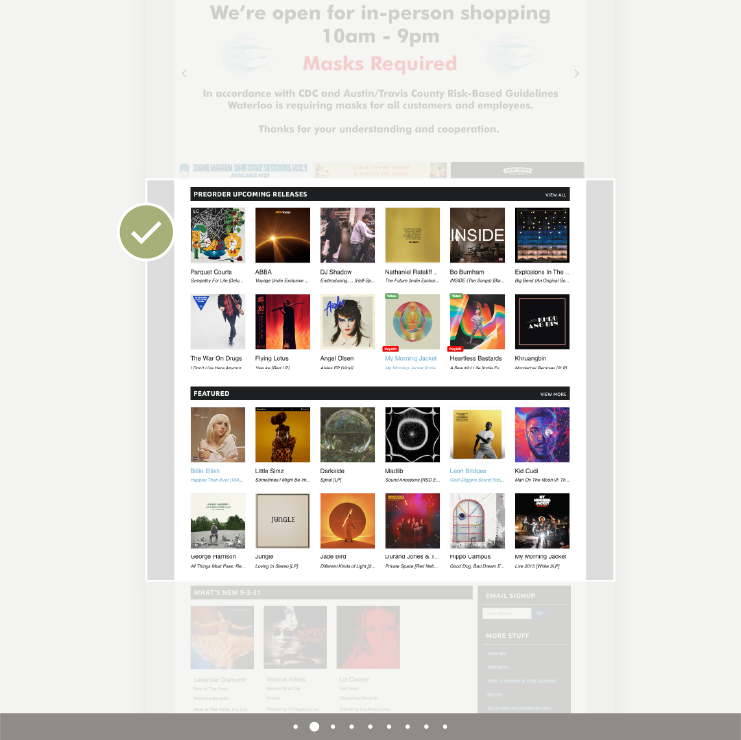
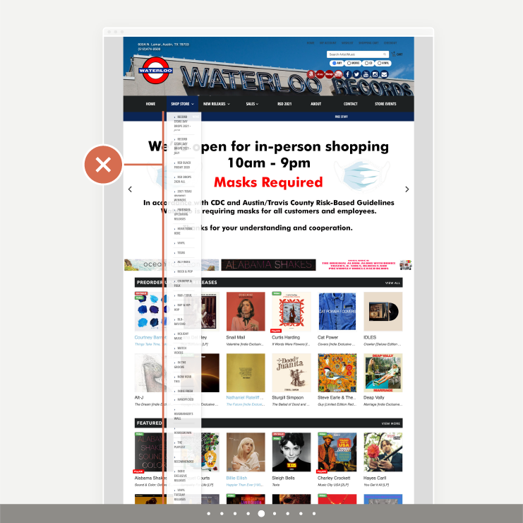
Waterloo's current website is rich in content and products the users are interested in. However, the way it's laid out is confusing and makes it difficult for the users to find what they are looking for.
I asked 3 users to share their thoughts on this website while browsing or searching for an album, and starting the checkout process.
Together with my own observations I made a Plus/Delta analysis, to pinpoint what was working and what needed to be improved:

3/3 users thought the overall layout was not well organized

3/3 users liked that there are lists of featured products on the Home page

3/3 users thought the information it displayed on the top carousel banner shouldn't be the main highlight

2/3 users liked that there was a Spotify playlist with staff picks

3/3 users thought the navigation criteria was unclear and confusing

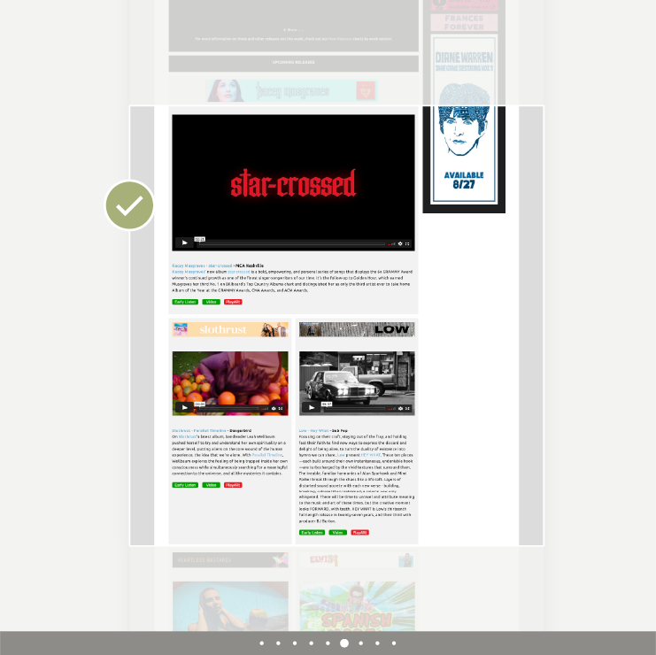
2/3 users liked the site's reviews and "magazine-like" content

1/3 user was confused by Format and Buy buttons, leading to add the wrong item to the cart

1/3 user was confused because the Unavailable and Buy buttons look the same

2/3 users mentioned the Checkout steps and layout could be improved
User persona
The collector
Matt | 37 | Audiovisual producer
Wants to find the "right" piece to add to his precious album collection. He highly values rare items and special editions.
Reads thoroughly credits and technical details. He trusts expert reviews, well curated lists and staff recommendations.
Is an “audiophile”, interested in music, sound equipment and the process of making albums.
Dislikes items in poor conditions and not being able to know enough product details before buying.
Appreciates convenience when shopping online.
User journey
Scenario: Matt is browsing on Waterloo Record's website, because he's interested in buying an Indie album.
Problem Statement
People looking for records on Waterloo’s website need relevant recommendations and clear product information, because they don’t want to feel lost when trying to discover new music and find the “right” pieces to add to their collection.

HMW Questions
How might we
... simplify the site's navigation and product categories?
... provide enough information while maintaining a clean layout?
... design a seamless checkout experience?
Design & Prototype
Site Map
Simplifying the site’s navigation and product categories
The original website had a long and disorganized list of pages and links across multiple navigation bars, which made it difficult for users to find the genres and products they were interested in.
In order to help users find the relevant products they were looking for, I redesigned the site map, by:
Deleting all single product pages from the top navigation
Deleting all empty or repeated pages
Regrouping them based on the type of content
Combining the menus to eliminate the side bar
Conducting a closed card sorting exercise with a user to validate and refine the new categories and labels.
Original navigation: 148 links.
Redesigned navigation: 31 pages distributed across 6 main categories.
Initial sketches
Refining the layout and visual hierarchy
I began sketching, trying to keep all the information the users are interested in, but organizing it in a way that didn't feel overwhelming.
Some considerations included:
Reducing the list summaries on the Home page, from 10 to 4 thumbnails
Using the top carousel banner for highlighted products or collections
Clearly distinguishing the format, price and add-to-cart button on the Product page
One idea that I would've liked to explore further but ruled out due to time constraints, was to have a play queue – the virtual equivalent of what one user said he liked best about going to a record store: collecting "a pile of maybes" and bringing them to the listening station.
Visual style
Keeping visual elements cohesive and on-brand
A moodboard helped me define the color palette, drawing inspiration from the two places that the brand refers to: Waterloo, the original name of the city of Austin, and the London Tube station.
The typeface "Din 2014”, a sans-serif font with excellent legibility and an industrial feel, was applied in Bold for main headings and CTAs, and in Regular for secondary buttons, subheadings and body text.
Wireflow
Can the users find their way?
The following wireframes illustrate the flow of how a user could find an album featured on a list, add it to the cart and complete the checkout process.
With this in mind, I made a mid-fidelity prototype, to test the effectiveness of the new layout.
Test & Iterate
Usability Test
I tested the mid-fidelity prototype with 3 users, obtaining the following results:
All 3 users were able to find a specific product under New Releases, either by clicking "view more” on the list featured on Home page, or by finding the category on top Menu.
All 3 users were able to find a specific Indie music album, locating that genre on top Menu.
All 3 users were able to add both products to the cart and complete the checkout process. However, one of the users wasn’t sure she had added the product to the cart successfully, causing a brief moment of hesitation.
What went well
All 3 users were able to successfully find the products they were looking for. They said the new labels and organization of the top menu made sense.
Users liked the layout and thought that the amount of information on Home, Category and Product pages was right.
What could be improved
One of the users pointed out that the feedback after adding a product to the cart (the buttons changing) was too subtle, and it made her doubt whether she was ready to checkout or not.
She also noted it would be nice to be able to change the quantity before getting to the checkout page.
Hi-Fi Prototype
Based on the usability test results, I redesigned the product page and added a prominent side overlay that provides clear feedback to the user when the item has been added to the cart.
What I learned
This last adjustment to the prototype was an important learning for me. Providing feedback after an action (such as creating a clear confirmation screen) is an important usability principle.
It also connects back to my user persona, “the collector”, giving a visual cue to celebrate a good find.
But as someone relatively new to the field of UX, it helped me develop a sensibility to those moments of interaction that, although seemingly small, can have a big impact on a user’s journey.


